In October, I realized I needed a new portfolio. Not the least reason because I was applying for graduate school.
Now if I was applying to an ordinary art program, I would just refresh my old portfolio, maybe spiff it up a bit and call it a done deal. But I was applying to UCSC’s Digital Art and New Media program, an unusual MFA program that focuses on the intersection of art, technology and social change work.
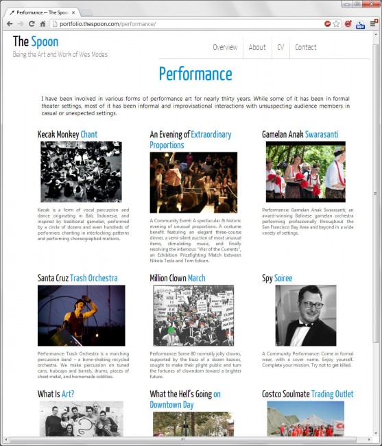
That meant that the many diverse areas of my life — art, technology, activism, non-profits, adventure, all of these things — were relevant experience to feature in my portfolio. I realized among the people reviewing my portfolio, there would be people interested primarily in my art work, while others would be interested in activism, and still others interested mostly in technology.
Design Challenges
This brought some interesting design challenges:
- There is a lot of material: nearly 30 years of technology work, 20 years of adventuring, and more than 15 years of art and performance.
- There are thousands of photos, sometimes hundreds of photos of a particular topic
- Existing documentation is minimal.
- No one is interested in everything: Potential visitors would likely only be interested in a few specific areas.
- Different content needs different forms: There were stories and photos and lists and blog posts, and all sorts of things that needed to be represented in different ways.
- There was some content on the previous site that people still depended on.
Design Requirements
These challenges suggested some design guidelines:
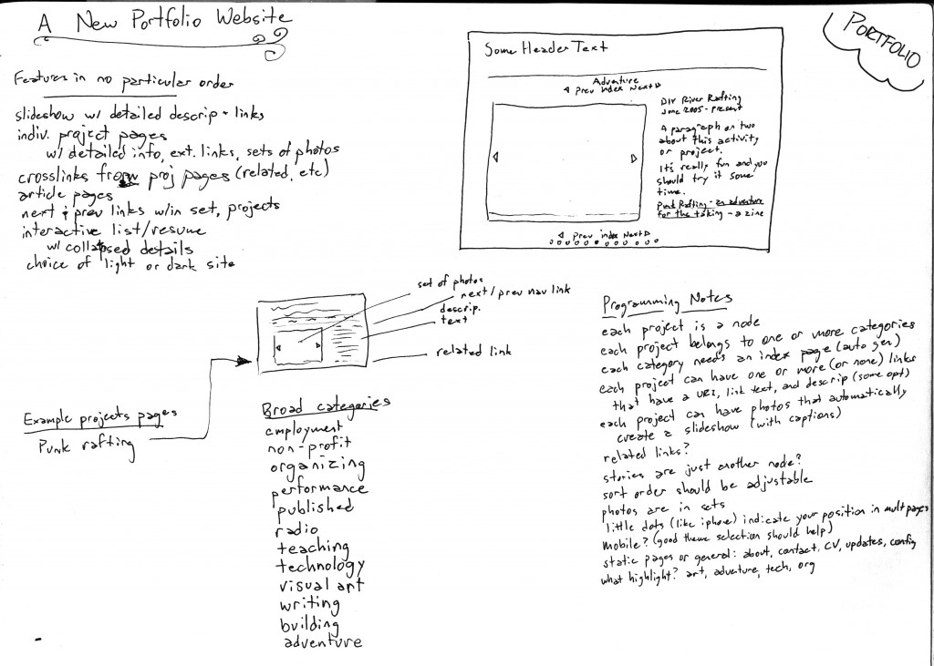
- Content is divided into different broad areas of interest
- Easily navigable from the top-level to your area of interest
- Each page or section could stand alone, if necessary
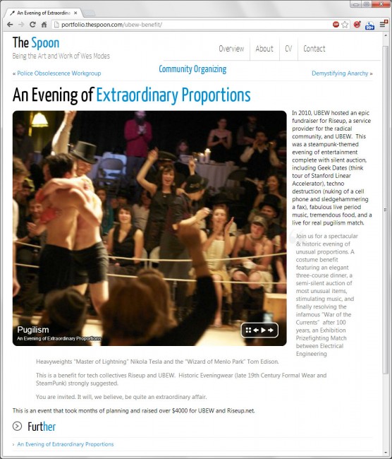
- Easily navigable to the next or previous content in the category or up to the category index
- Photos featured front and center
- Slideshows for content with multiple photos
- Plentiful cross-linking through “See Also” and automatically generated “Related Links”
- General static pages for About, Contact, Resume, etc
On top of these requirements, I wanted a super clean site that looked stylish and visually interesting.
Technology
I’d done a recent project in Drupal. While I think Drupal is a good choice for institutions with resources who want to do lots of database cleverness within the WCMS, Drupal’s complexity and development challenges killed the project (and nearly the tech group working with it). I’d heard good things about WordPress and wanted to try that out. It is a choice that I’ve been very very happy with. In general, WordPress and its Addons are more finished and considerably more user-friendly. Even from the point-of-view of a programmer and web developer, WP has been a joy to work with.
I chose the Montezuma theme, which I immediately heavily modified. I chose the NextGen Gallery for image management, and the highly-customizable flash-based Monoslideshow for showing series of images. I wrote a lot of the smart index pages in PHP which was fun.
Creating Content
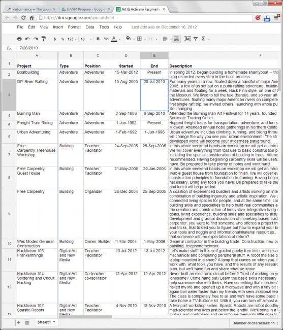
By far the most difficult and time-consuming part of the task was adding content. I started by making a Google Docs spreadsheet of all the content I wanted to include. This was a pretty substantial undertaking in itself, recording every Free Skool class I’ve taught, every job I’ve had in technology, every performance I’ve taken part in, every art show, stories, published works, and so on.
Then the long, several months of turning each of these spreadsheet rows into unique web content began. There were a lot of emails and Facebook posts to friends that looked like this:
And tons of photo inquiries of friends:
Subject: No photos, huh? Date: Wed, 31 Oct 2012 12:11:49 -0700 From: Wes Modes <wmodes> To: kris yunker <klaatuniktu> Kris, do we have any photos of us doing Monkey Chant? W.
My friends were awesome and generous and generally confounded by why I wanted to revisit decades-old history.
A Weblog Feature
Some content (serialized stories, journals, collections of writing) are better in a more bloggy format. If a page about a performance I took part in a decade ago is a static node on the site, I needed a place for things that were more like loosely connected articles, more a box or container.
I created a blog functionality for articles in a few different areas, principally art and games, with more to come, adventure and political philosophy. Each blog is uniquely banded, but shares site consistency.
Testing and Rollout
For a project like this, I’m not sure it is ever done. There is still content I intend to add but haven’t. There are still photos I know I need to find. There are still things to be transferred from the old site.
Worst of all, there are some cross-browser compatibility issues. From the beginning I chose a WP theme that was alleged to be a “responsive” theme, that is, ultra compatible with mobile devices, presenting content in a ideal layout for small screen mobile phones.
However, my portfolio currently has inexplicable problems on iPhones Safari browser. It is maddening. I’ve enlisted über-geek friends who’ve been unable (or perhaps too lazy) to diagnose my problem. Additionally, iPhone Safari doesn’t support flash, so my flash-based slideshow doesn’t appear. It would be easy enough to conditionally offer a more plain vanilla JavaScript slideshow for iPhones, but I haven’t yet found the time.
That said, “Perfection is the enemy of good enough.” There was no final Ta Da! moment when I could say I was good and done. And so it was launched in a sorta sneaky incremental way.
But overall, looking at the big picture, I’m not displeased with the results.





It’s been nearly two months since we met at the SantaCon in Felton, and since then, I’ve caught occasional glimpses of you through FaceBook, or at a social event. My initial impression of you was one of delight and surprise, and also appreciation for your clever and creative approach to costuming. Now that I’ve discovered your blog and portfolio, I’m blown away by the volume and array of pursuits and projects shown here. I like simplicity of the format, and have really been enjoying all that you’ve shared here. Thank you!
It was a joy to hang out with you in a context of grown-ups making whimsy and play.
Thanks for your support and comments. Glad you like the blog!