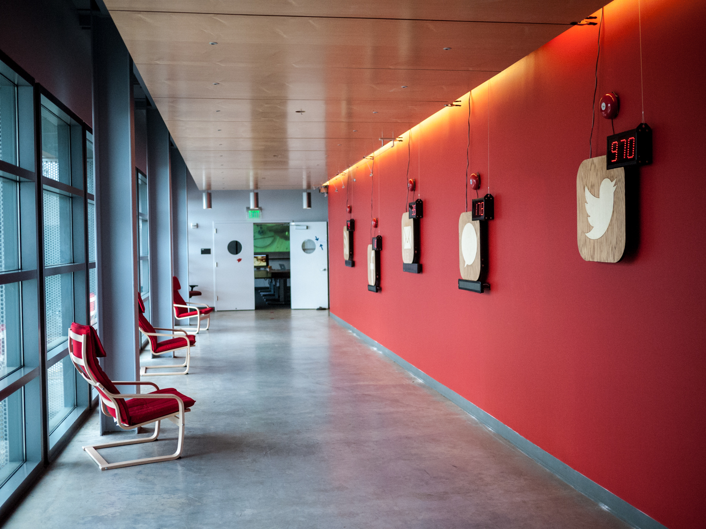
FOMOphobia, an installation at the Digital Art Research Center at UC Santa Cruz as part of the Digital Arts and New Media Fall Open Studios, attempted to embody the social media burden of the artist. Incoming messages, notifications, and tweets are signalled with loudly ringing bells, flashing red numbers, and an alphanumeric LED display of the content.
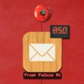
At the DANM Open Studios there were five individual pieces representing Twitter, Facebook, email, sms/voicemail, and rss feeds (blog reader). Each piece consisted of a two-by-two foot wooden medallion of white mahogany inlaid into golden oak replicating in large-scale the familiar iPhone icons, a large red LED numeric display showing the number of unread messages inset into the upper right corner (also calling to mind the badge notifications on an iPhone), a red alphanumeric display along the bottom displaying incoming messages, and a red alarm bell hung above the piece.
As each message arrived, the corresponding piece would ring for several seconds, the number of unread messages would be updated, and the message, sms, email, or tweet would be displayed.
The skillful inlay combined with the light birch and red IKEA-style chairs of the installation made a curiously attractive and inviting exhibit, punctuated by jarringly disruptive moments as batches of messages arrived.
The installation proved to be surprisingly interactive as well. It was not unusual to find a crowd either waiting and watching for new messages or eyes-down to their smartphones texting, emailing, or tweeting the author in an attempt to see their messages appear. A few times, viewers let out a little squeal of surprise when a loud alarm bell went off.
From Concept to Realization
For the Fall Open Studios exhibition of the Digital Arts and New Media program at UCSC, I created FOMOphobia, an internet-connected sculpture that immerses the viewer in a visualization of the artist’s real-time social networking anxiety, sounding alarms and keeping count of unhandled content.
The project was originally conceived as a part of Fun-A-Day, an annual January art-making marathon created by UCSC DANM alum Nick Lally. For Fun-A-Day, during the month of January 2013, I created a blog post each day that proposed a new art project, many of them New Media art. For one of these, I responded to an article I had seen on Hackaday.
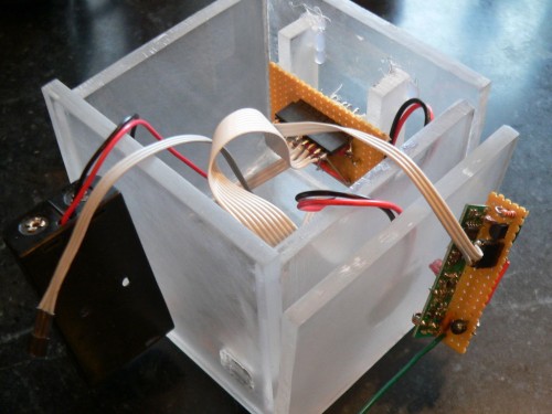
Figure 1
Wireless unread email counter tells you how busy you’re not
One of the marks of how busy you are – or how well your spam filters are set up – is how many unread emails you have in your inbox. Trumpkin over on Instructables posted a great tutorial for making a wireless counter that displays the number of unread emails in your Gmail account. (Figure 1)
Clearly, this is supposed to be utilitarian, a clever way to see whether you need to drop everything and check your email. To me this looked like my social networking guilt made manifest. I wanted to take this absurd concept to the next level.
What if we make the order to drop everything and get cracking on your social networking more explicit? I wanted a klaxon of some sort, a more visible counter, one of these for each of my many forms of modern communication.
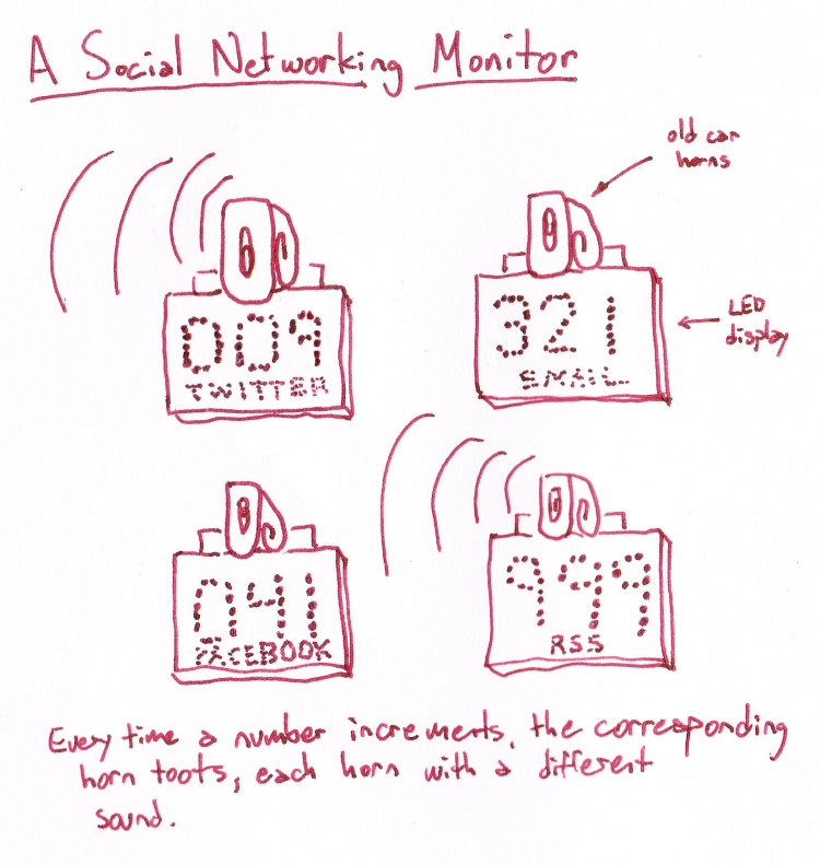
Figure 2
Together, they would create an audio-visual manifestation of modern communication angst, an insistent cacophony of social networking.
I originally conceived that the number would be primary and topped by a car horn. This was in keeping with my usual use of recycled and scavenged materials (Figure 2). However, the feeling of the piece didn’t lend itself well to recycled materials. I looked at the possibility of using new, hard and shiny materials, creating some digital concept sketches of the pieces (Figure 3) and possibilities for the installation (Figure 4).
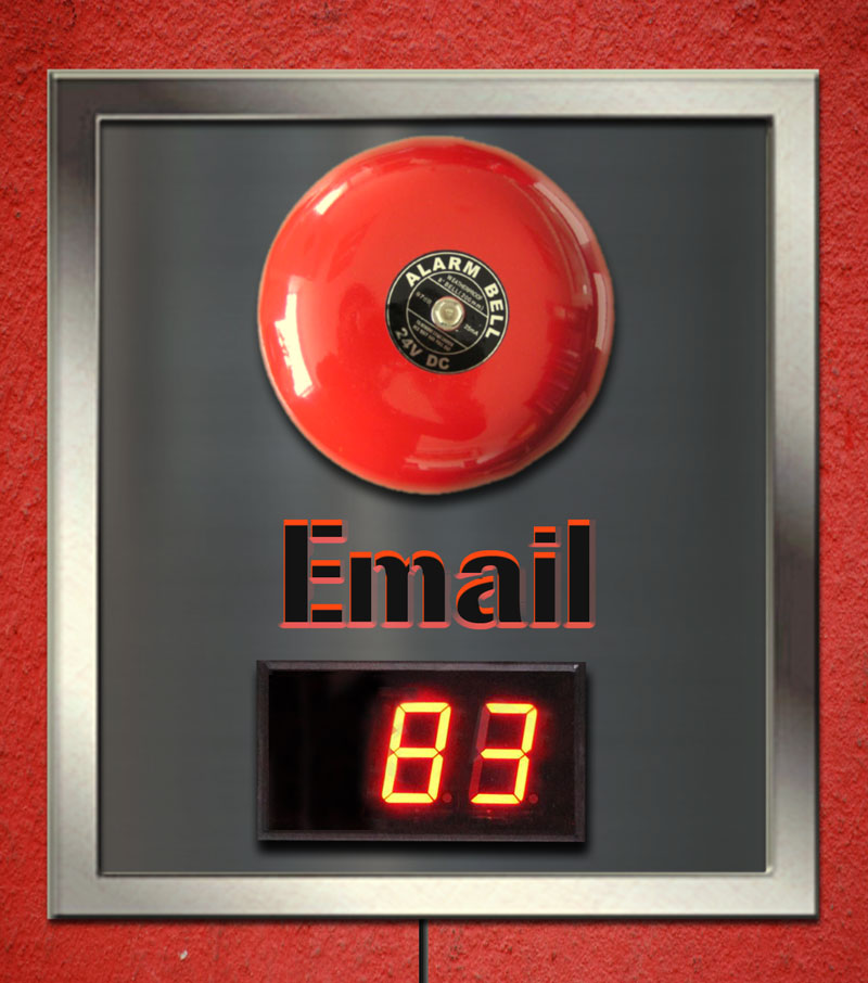
Figure 3
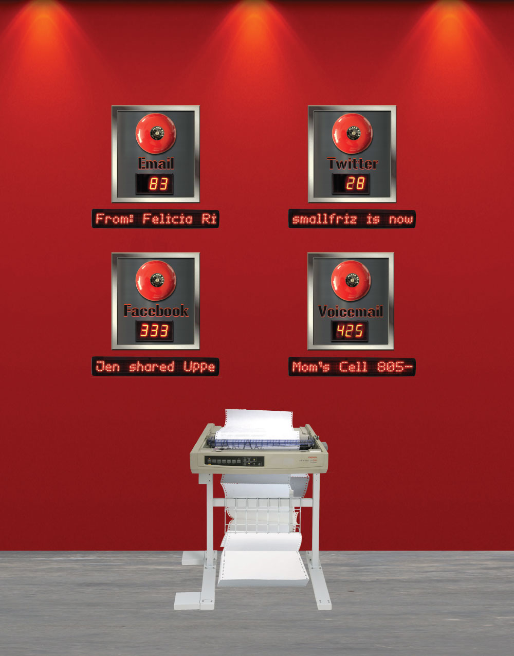
Figure 4
The stainless steel frame and engraved plexiglass meant to give it a hard-edged institutional look, did not seem to suggest the feeling that I wished to invoke in viewers, one of both attraction and repulsion. I struggled to discover the exact aesthetic language of the piece. I did work deconstructing the aesthetic palette of a small handful of places that were suggested in a brainstorm during an early critique of the piece.
Every place we go and every place we create has an aesthetic palette from which it draws the colors, the texture, the sounds, the smells, the iconography, the typography, the organization, all the sensory and symbolic data that make up a place.
This aesthetic language of place forms a rich broth from which we derive an emotional reaction. This feeling is a complicated and layered mix of memories and associations that we instantly relate to the sensory and symbolic detail of a place. Old wood and warm colors and smells of woodsmoke leave most of us feeling cozy, restful, and safe. Light and bright colors, hard textures, and sharp corners make us excited, energized, ready to be productive.
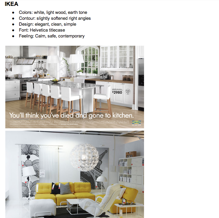
Figure 5
Reactions to an aesthetic language of place are far from universal. The aesthetics of a cozy cabin might make you feel claustrophobic. Hard edges and clean lines might make you feel alienated. These associations are wholly learned. They are part of the social fabric in which our own experiences are woven.
For place creators, designers, product makers, and artists this aesthetic language serves as a kind of shorthand. It creates a link to a feeling associated with a place.
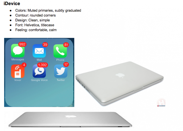
Figure 6
In general , given the goals of the piece — a form that should be simultaneously attractive and repellent, both seductive and insidious — I was drawn to the rather similar IKEA (Figure 5) and Facebook office designs. I also drew heavily from the iDevice aesthetic palette (Figure 6).
The resultant pieces borrowed heavily from the place language of these aesthetic palettes.
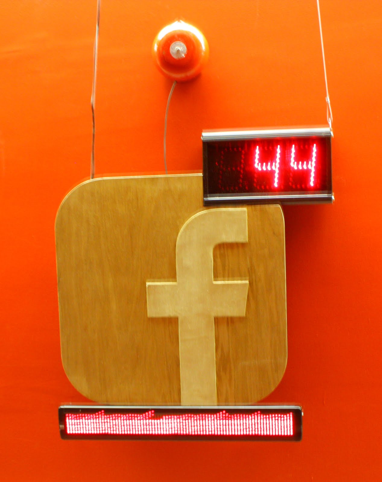
Figure 7
With the exception of the LED digital displays, the technology of the piece, consisting of microprocessors, wireless interfaces, serial connectors, and server-based data gathering is largely and intentionally invisible.
FOMOphobia, An Analysis
Looking at FOMOphobia, I’m not displeased that it all came together. It was relatively ambitious for a first quarter project, and it achieved many of the goals I set out for it, both attractive and repellent, comfortable and jarring.
There were several times when I was standing near the sculpture talking to viewers about the piece when an alarm would loudly interrupt our conversation. In these moments, everyone stopped to read the incoming message as it was displayed. Trying to resume our conversations became increasingly challenging.
A few times when I went to observe the piece, there were a half dozen or more people standing in front of it, all looking down at their smartphones. At one point one person looked up and self-consciously laughed, “Everyone is on their phones, talking to the art.”
A feeling of excitement tittered through the crowd every time an alarm sounded. I question whether I have created the feeling of repulsion I originally sought or whether I have merely replicated the emotional draw of social media, a feeling of curious attraction with some jarring tradeoffs.
I wondered if the piece was sufficiently embodied to draw visitors into a sensual appreciation of the piece. The alarm bells were designed as an assault on the senses. The chairs were an attempt to take space for the piece, to bring out a third dimension for a wall-mounted work, and an invitation to bring the viewer’s body into the piece.
The technology behind FOMOphobia worked serviceably, but not flawlessly. Once I had to reset the system during the show because the wireless router had frozen. The rss piece stubbornly refused to display messages consistently. I would like to fix some of these technological bumps.
Further Directions
My MFA work is still being drawn from my large menu of interests and passions. Looking back at my current and past work empirically, I can see that some themes consistently emerge: Questions of authentic interactions between people and places, the ways in which people make decisions and appeals to higher powers, the substance of loss and memory, and building non-hierarchical community infrastructure.
Some of these lend themselves more readily to New Media; some less so. In the next quarter for instance, I will be working with Dean David Yager to create a network-connected installation, so most immediately my work will be moving in that direction.
I am in both the DANM Playable Media and Mechatronics project groups, so inevitably I will be pulled in those directions as well.