You may remember that recently I posted about the Decision-Maker and my desire to create a physical sculpture that serves as a decision-making machine. Also recall that I long ago created The Decision-Maker Online. Feel free to try it out.
I’ve been thinking more about that.
What would it take? Beyond the aesthetics I talked about earlier, how could you gather and represent the quantity of data the Decision-Maker requires?

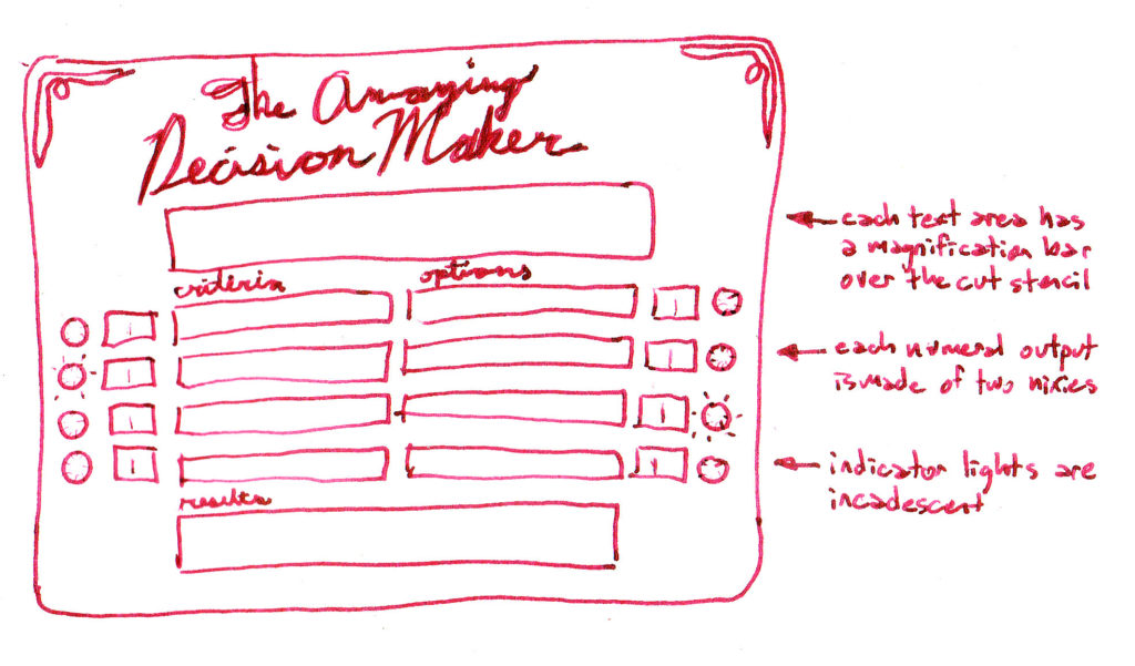
Let’s say we have a small output screen for up to four choices, up to four criteria, a bigger one for interactive instructions, and maybe one for results, plus each of the criteria and choices need a numerical output to put the rating for each. That’s something like 18 little LED or LCD screens. Add to that a half dozen or more indicator lights, a couple variable resistors, some push buttons, a keyboard? Yikes!

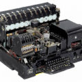
When I started to put everything together it looks a good bit like a control module from Cape Canaveral circa 1970, which of course has its own charming aesthetic, but not was I was originally thinking of.

Of course, I could skin it however I wanted, but something in the design didn’t look right. I considered the possibility of not having text input, but have the user write in the choices and criteria, though I wasn’t excited about it for artistic reasons — it reduces the magic.

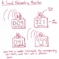
Lastly, I thought about the possibility of hiding a screen behind a cut-out template. This would significantly reduce the hassle of dealing with output.

This is much closer to my original idea of something functional, physical, and with an aesthetic of oddly mixed eras.